
Designing for the web and apps
The designing of different things – from business cards, to websites, to buildings, to furniture – each involves different techniques and knowledge. Which is why it’s important to get a website or app designed by an experienced digital designer.
A furniture designer may be able to draw you a beautiful looking building – but it doesn’t mean they’d know how to draw the necessary blue prints the way an architect would. And in the same way there’s more of a divide between print design and web design than many people credit, because they’re for such different media.
Personally, I’m certainly not a print designer! And so many years ago I went down a strictly web route. I get nervous about bleeds and check proofs a million times. I don’t know whether something should be spot colour or litho, and can’t decide between gloss and matt. All of my issues with print would probably fade if I did it more and learned what different print techniques meant etc. but I opted for a 100% web route.
Meanwhile, with a website – I know what a developer needs. If I do a design that’s a little bit different, I work out how it could be built before I get it signed off. I work from wireframes that I’ve studied, if not done myself, so I know what areas need to be able to grow and move. If I’m designing for software I know what features the software has so don’t design something that looks great but will mean an extra few days development and more cost for the client. I understand templating and keeping constants if required. From a 50 page doc of wireframes I know what sort of elements will be pretty constant and so what pages need fully designing and what ones will fall naturally into a design that’s already been done in order to suit a budget. i know how to design with SEO in mind, or with very high levels of accessibility. For HTML emails I know what email clients can support and so only produce designs that are possible for that medium. And like me with print types, these are all things any designer can learn – but it takes time and dedication.
It can make a developers job a lot harder when a non-web designer provides them with a design because often even the artwork isn’t supplied in the right format. It can also cause them to have to ask lots of questions about things the non-web designer hadn’t considered. How a print designer views elements sitting on a page can be very different to how design needs to work on the web – there’s a lot of fluidity required within web design which not all non-web designers are comfortable with or fully appreciate. Sometimes this lack of understaning about the medium can produce really exciting designs because the designer isn’t contrained by any previous knowledge of what’s “the norm” or possible. But more often than not, especially in the case of websites with a CMS/ones you can update yourself, it results in quite a limited overall template which doesn’t really function like a usable, dynamic website.
I often hear “but I want all of my design work done under one roof”. And that’s completely possible because you can find plenty of agencies with experienced print and web designers and there are lots of designers out there who do understand both mediums. Just ask to see lots of examples of their work. But also, as the 2 are such different media, you can happily work with 2 agencies; good web designers are very used to picking up and running with supplied logos and print elements in order to produce a matching website. If you find a print agency who’s work you really like but you aren’t sure they have the web experience, ask if they have a digital partner as many do now a days. This means they have found a web company they’re used to working with and the process can be as straight forward as just being in different departments of the same agency. Lots of agencies have digital partners that they keep secret and just let you think the work is all being done under their roof – and, really, if they work well together and this arrangement is handled properly this isn’t much different to just them having a “web office” down the road with their employees in it. It just means you have 1 point of contact rather than speaking to 2 companies. But you ideally need to be able to speak to the web people if/when the need arises as otherwise it can turn into Chinese whispers when you have a technical question and it has to go through a non-web project manager or account handler.
Designing for software
The main thing to be aware of here is that whoever is designing your website needs to understand the software they’re designing for.
If someone is designing you a shop that’s going to run OpenCart software, or they’re designing you a blog that’s going to run on WordPress, they’ve got to know that software really well and so know what’s possible (within the quoted development time) and what needs to be done. Sometimes a surface look at a piece of software doesn’t come close to showing you all the different interfaces involved with a piece of software.
So if your website is going to be based on a piece of software, make sure you see some examples of how your designer has designed for that software before and make sure you feel confident that they’re familiar with the platform.
Fonts in web design
For years and years you could only (for best results) use fonts that were guaranteed every computer viewing the website would have. But now you can experiment and be much more creative!
The way it used to work, and, well, still does – is that a website would tell the computer it was being viewed on “please use font xxxx for the writing on this website”. The computer would then find that font from it’s font library and show you the writing in that font. However, if the website said “please use font xxxx” and the computer didn’t have that font, the computer would try and find a suitable alternative from what it did have…. which would mean, at best, you didn’t know exactly what the viewer was going to see because you didn’t know what their computer would choose, and at worst the computer might pick an awful font and leave the website unreadable.
A website could tell a computer “use font xxxx or if you don’t have it use xxxx” and make sure there was a safe back up plan, but this still means that you’d have visitors viewing different things depending on whether they had the font or not and sometimes it’s just nice to know exactly what people are seeing!
It’s also worth mentioning that you have to think about the platform you’re using – I’ve had lots of designers who use Macs send me web designs with Helvetica – but PCs don’t have Helvetica as standard so it doesn’t count as a “web safe font” just because Macs have it.
So we’d stick to arial! Or a select few others.
But now! Now we can provide the font files with the website files, meaning the computer doesn’t need to call on it’s own resources at all. If you want to use an unusual font, you supply the font too. You of course need permission to use the font files and that’s done through licenses but it’s all made very simple by sites such as fontsquirrel.com or Google Web Fonts - just browse the site, choose your font and make sure the license details suit your use (generally commercial or personal).
So if you’re providing a web design for a developer, be sure to stick to arial, times new roman, verdana, tahoma or another font you know to be safe, or check out fontsquirrel and send your developer the font files or a link to the right download page with your designs.
Personally I just want to find the time and the excuses to design a site for every commercially licensed font on their site – I love this new freedom that’s available! Whilst technological advances continuously go on in the web world, many of these are behind the scenes to the average web user, so I think the opening up of font availability is one of the biggest changes in websites that the public will notice for a while.
"In-browser" vs. traditional design
For all the years I've been designing websites (just over 10, at the time of writing this) I've done my designs in Photoshop, and gotten full approval / sign off from a client before starting to build them. This means I present them with a picture of how the site will look and refine that picture through discussion with them, before that finalised design is then build in code.
However, a new wave of web design is upon us, whereby the designer/developer does the design in code from the offset. You may discuss themes or colours or perhaps even have a mood board put together before design and build starts, but the actual design itself is done in HTML and CSS rather than in Photoshop. You can then see the design as a website - rather than being sent a picture and having to visualise it.
I can definately see the advantages of this approach as sometimes some clients do find it difficult to imagine a picture as a real, clickable website. And if you're working with the right people this could really speed up the design and build process - it's actually how we've worked on inhouse projects for years; I work with my husband quite often so we're comfortable just putting things together that we know each other will like. Or we may design a home page the "traditional" way but then do the internal pages "in-browser".
When it comes to doing designs for clients though, at the moment I still want to stick with Photoshop. In-browser changes are fine for when you want a font a different shade or to tweak some padding or enlarge the font size by a couple of pixels. But some things just take much longer in code than they do in Photoshop and so if the client required structural changes to the page, the process would take longer overall. Plus, we tend to like to see all of the designs for a site before building anything, so that we can consider our CSS classes and keep the code as neat as possible - if you build a home page without knowing what's around the corner it gets trickier to keep global stylesheets neat.
Supplying (traditional) designs
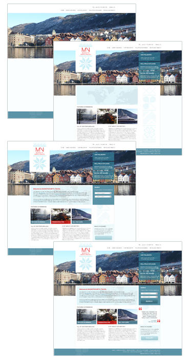
A common query I come up against with designers who don’t principally design for the web, is what is meant by a “layered design”.
If your website is very simple in design and features, then this might not be relevant. But if your website has the ability to “do” anything, including letting you update it yourself, or if the design has nice details, then the developer building the site generally needs a layered PSD (photoshop file). Many print designers use programmes which produce PDFs, which are great for sending something to print, but not practical for building a website. This may mean doing the design in different design software than your designer normally uses, which is why it can be important to use a web designer rather than a print designer for your web project.
When you have your design done, this is actually just a representation of how it’s going to look – it’s not actually the website itself. It’s just a picture of how it’s going to look. Which is why you can’t click on anything / there aren’t links or real text. The design is just to show the developer how the site should look so then they will write the correct code to get that end result.
The reason the developer needs layers is because if there’s a background pattern or image, the developer will need to cut that out and use it, but with no writing or text on top, as this is written in the code separately. Or there might be a button with a shadow – and they need to be able to hide the background so as to see just the button and it’s shadow. You don’t really need to understand how this all works, but the point is, you can’t supply your developer with a PDF for a complex site build because they won’t be able to get what they need from it.
The image below shows how a design consists of stages and layers – if a developer is supplied a flat PDF or jpg alone they won’t be able to turn layers on and off like they need to.
“Real size”
It’s also important to make sure the design is the actual size the website should be – the design the developer receives should be the exact dimensions required so any elements that need to be cut out of it can be without being resized. It’s also important that it was designed to the right dimensions, as doing a design at 3000px wide so it looks great when you print it out on an A3 sheet and pin it on a flip chart isn’t much good if when the designer has to change everything down to 900px wide you find the columns widths don’t work so well or the text is too small.
We'd love to hear how we could make all this content easier for you to digest and use. Please give us any feedback you've got from using the site.
The Knowledge Base
Our knowledge base is split into categories, with an introdution to various differnt aspects of that category, followed by current topical articles which we constantly add.